Interview: Peter Rapp, creator of Lightbow
Peter Rapp, the creator of Lightbow, uses PaintCode to draw beautiful dynamic light bulbs. He was kind enough to let us include an interactive example1 in this interview, so you can play with it, too:
This is a great example of using dynamic vector graphics to make the user experience better. We've interviewed Peter about his work and using PaintCode in production.
I spent 10 years of my life at Apple on the software engineering end, working alongside some world-class design talent.
Peter, tell us a bit about yourself and your work.
I’m a PaintCode addict. I spent ten years of my life at Apple on the software engineering end, working alongside some world-class design talent. Our iterative process produced great results, but the number of iterations would raise your eyebrows. Anything slowing down that cycle is toxic.
After I quit Apple and decided to do some hobby development, I turned to PaintCode to give me more direct control over my artwork. I wish I could have used PaintCode in my workflow at Apple, as a Rosetta Stone for engineering and design to work together.
Think about it — designers could use PaintCode to flag some color, stroke thickness, or corner rounding that was up for debate. Engineering would put the generated code in the right place, and we could play with those parameters and iterate in realtime at the next design review meeting.
My app Lightbow is one of the best light control apps on the App Store. If you’ve never heard of the Philips Hue, check them out at your local retail Apple Store. Network-connected light bulbs that can be any color/brightness, react to your environment, last for decades, use less power, and help the environment: certainly these are the future of lighting once the price comes down a bit.

I wanted the icons to reflect the current color of the physical light bulb!
Where does PaintCode fit in?
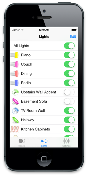
It was important to me to have quality icons in Lightbow to represent a user’s lighting hardware so that they could easily identify lights in their list. There was one problem that made traditional artwork impossible — I wanted the icons to reflect the current color of the physical light bulb! Sure, I could apply some cheap tinting effect, but what I really wanted was all the outlines, gradients, etc to properly ramp with the seed color. Here are some examples:

These look really great, how did you made them?
Static icons weren’t good enough for Lightbow. Some of our users have setups that cost over $1,000 with dozens of light bulbs. It was important to me to be able to have the light list reflect the color of the light setting in real life, and be a beautiful icon representation of the actual light hardware. Experiments with standard images and tint colors weren’t panning out, so I turned to PaintCode.
In terms of process, I started out by digging up multiple pictures of the lighting hardware on the internet or from users. Lightbow supports the Philips Hue, Iris, Aura, Bloom, LivingColors, LightStrips, and more, and some of this hardware is only sold in Europe. Armed with some horrible pixelated screenshots, I started by setting the “Use Image:” section of the canvas popup to some image, and then using the drawing tools to trace out the basic shapes of the light. For the external plastic and metal pieces, I experimented with gradients and shadows to create just enough depth and texture to be beautiful but not distracting.
PaintCode lets you define dynamic relationships between colors. You use this a lot in Lightbow.
The real payoff though was when it came to expressing the current color of the light. I had one color named “baseColor” and set it to a deep red. Every time I needed a variation of that color, I used PaintCode’s “Base Color” feature, defining the necessary variations by choosing “Apply Highlight”, “Change Opacity”, or “Apply Shadow” in the color popup and typing in a percentage. As I was working, I could then set the original baseColor to a sampling of blues, greens, whites, or blacks and see results instantly to make sure the icon would look good regardless of what the user set for their light color.
The first time I saw this working, I had goosebumps.
Back in Xcode, I pasted each bulb’s generated drawing code into a method that passed in a UIColor baseColor. Since all other colors in the code were derived from that one color, it was really just that easy. The first time I saw this working, I had goosebumps. This would have been a huge hassle to accomplish in the world of using pixel-based artwork instead of drawing by CG calls.
My skills are in software engineering—I am not a graphic artist by any stretch. Still, with a little practice and patience, PaintCode was able to give me results I’m really proud of. I can only imagine what can be done in the hands of a real graphic artist.

What tools did you use when making Lightbow?
I'm proud to say that all of my artwork (including my app icon!) are drawn in PaintCode. I have zero pixel-based artwork in my app bundle, except what is required by Apple (obviously the Icon.png and the Default.png launch screen). Resolution independence is important to me. The colors of the icons react to the colors of your lights in the real world. Users love it! I make heavy use of Base Color / Derived Color sets so that the icons take one input color and the generated code takes care of all the subtle variations.

With actual generated code at your fingertips, that artwork can react to its “environment” with a few cleverly-placed input parameters.
How did iOS 7 affect your design decisions?
I originally started casual development of Lightbow on iOS 6, but after watching the WWDC keynote on iOS 7, I knew I needed a full UI reboot. I was very apprehensive at first because it would be a lot of work, but the more I got into it, the more I realized that the iOS 7 ideals of clarity, deference, and depth would force the hard choices that ended up making my app even better. Lightbow is all about colors and the lights you assign them to, so with every version I try to refine the interface for clarity of function, and deference to content (in my case, colors and lights).
I think iOS 7 should make tools like PaintCode even more important, since there is a clear shift from pixel-tweak-heavy custom textures to crisp and clear vector-based artwork. With actual generated code at your fingertips, that artwork can react to its “environment” with a few cleverly-placed input parameters.
How do you think UI design on Mac will evolve in the future?
The Mac side is harder to pinpoint. The obvious trajectory is that the look and feel of iOS, Mac OS, and web-based iCloud interfaces will converge into some unified themes. Just look at the latest developments in the iWork universe. That said, nobody knows better than Apple that each platform has to play to its strengths and be true to itself. The iPad and Mac experiences are different enough that you can’t just expect to slap the same UI in both places.
Thanks for the interview!
You can buy Lightbow on iOS App Store.
1 Philips LivingWhites, the lightbulb on the right, can’t actually produce arbitrary hues (only the brightness can be adjusted). We just used it as an example because it looks great. Peter kindly sent us his PaintCode document and we used our WebCode app to produce this interactive example (with some manual tweaks).
